Digital product / Design Systems
AAM Interface Kit
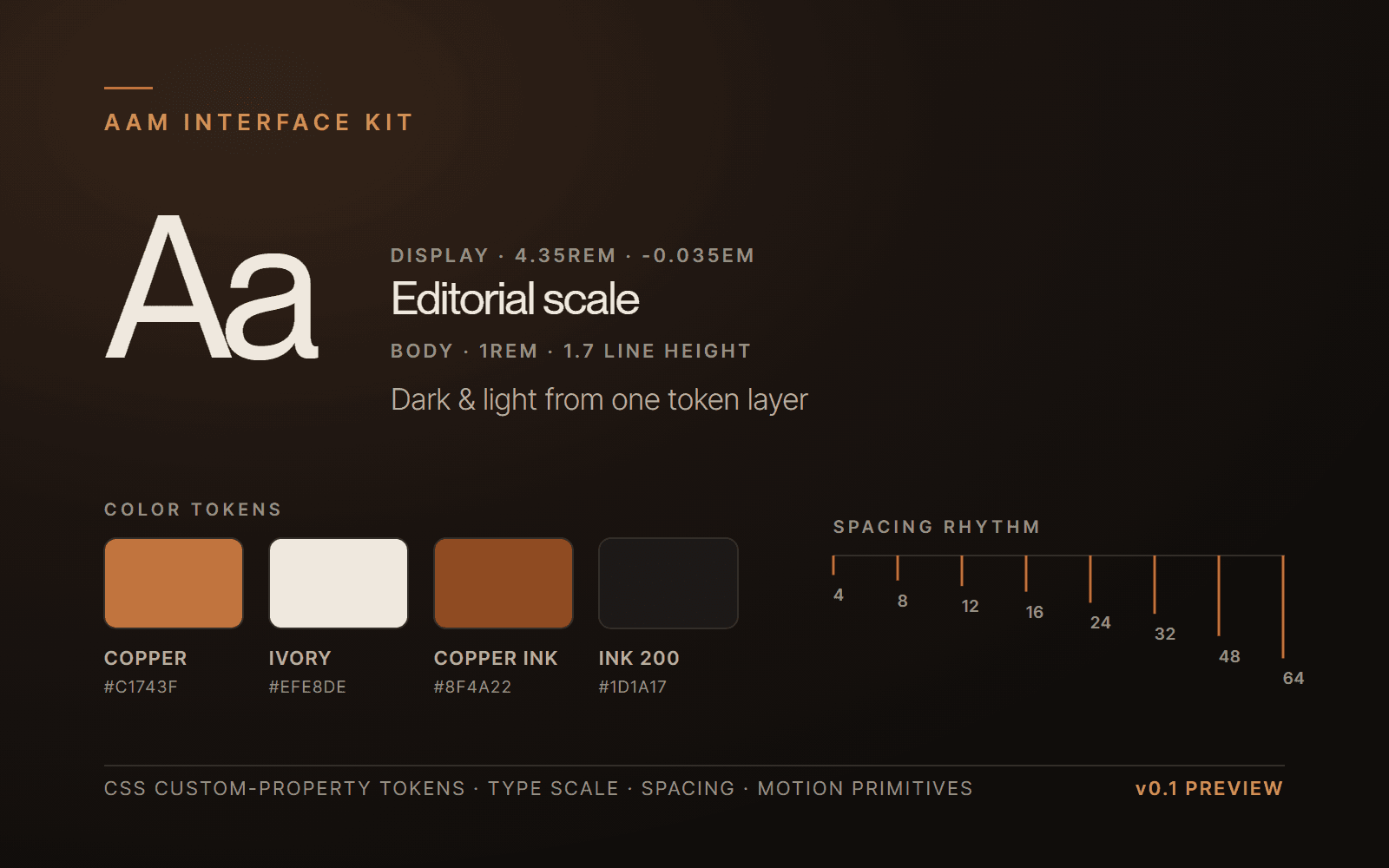
The type scale, spacing rhythm, and interaction primitives behind every build on this site.
Product preview
01 / What it helps with
The problem it solves
Consistent interfaces come from a small set of deliberate decisions, not one-off styling. This kit packages the exact system used across this portfolio — typography, spacing, color tokens, and interaction primitives — so new screens feel considered without redesigning the fundamentals.
02 / What's inside
What's included
- Design tokens for color, typography, and spacing
- Editorial type scale and spacing rhythm
- Interaction primitives (reveals, hover, badges, cards)
- Usage documentation and examples
03 / Capabilities
What it does
Tokenized theming
Dark and light modes driven by a single token layer, mirroring this site.
Typography system
A restrained display/body scale with defined roles for headings, labels, and body copy.
Motion primitives
Reusable reveal and transition patterns built to respect reduced-motion settings.
Component foundations
Card, badge, and layout starting points that share the same rhythm.
04 / Before you build
Technical requirements
- Format
- CSS custom-property tokens + documented patterns
- Fonts
- Two-family system (display + body); font files not included for licensing reasons
- Prerequisites
- Comfort with CSS custom properties and a component framework
05 / Terms
License & support
A single-developer license for building your own products. Exact terms are confirmed before purchase.
- Personal and single-team commercial use
- Fonts are referenced, not bundled; you supply licensed families
- Update and support scope to be published with the release
Support
- Documentation for adopting the tokens into an existing project
- Email support during the early-access window
Version 0.1 (preview) · In development
06 / Questions
Before you ask
Does it include fonts?
No. The kit documents the two-family approach and token scale; you license the typefaces separately.
Is it a Figma or code system?
It is delivered as code-level tokens and patterns. Layout and adoption guidance is documented.
Coming Soon
Want first look when it ships?
There's no checkout yet. Reach out to discuss the upcoming release or request early access.
More from the Market
Browse all products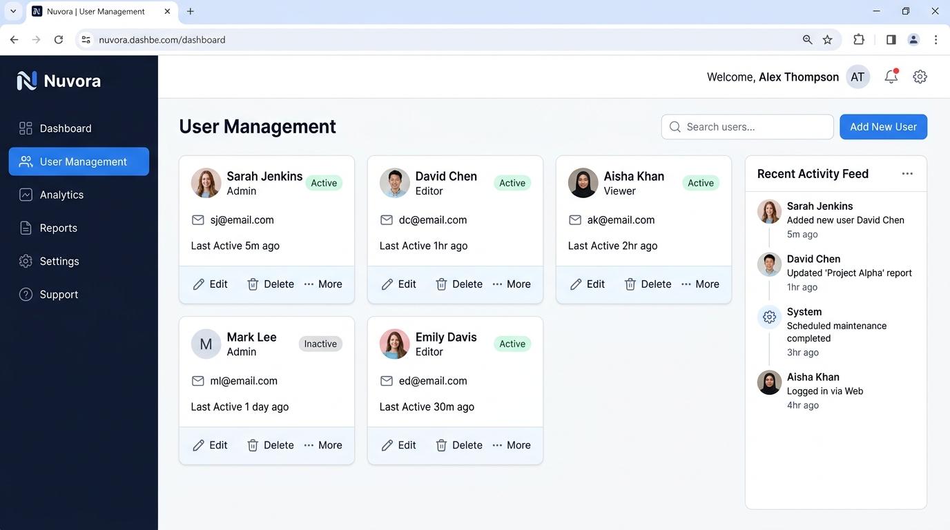
React Dashboard Kit
A comprehensive collection of dashboard components, charts, and layouts for serious admin interfaces.
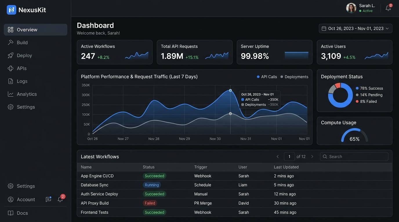
Next.js SaaS Starter
An upcoming starter template exploring authentication, billing, and dashboard foundations for SaaS applications.